Charts Getting Started
Contents
Introduction
The chart package in mTAB has been given a complete update to include the additional charting and graphing options, more customization and control over creating visualizations in mTAB, and the ability to export the visualizations from mTAB into native, editable PowerPoint and Excel files. The actual data used to create the chart will be included in the PowerPoint or Excel files.
Getting Started - Select The Data Range
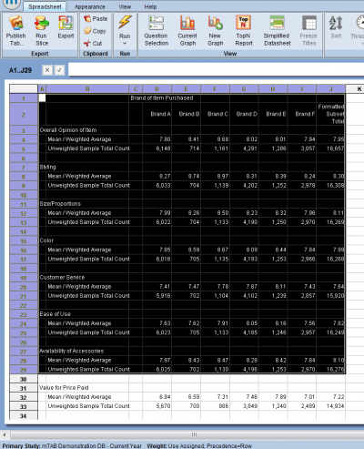
To start, setup your questions in rows, columns, etc. and click the lightning bolt.
You'll be taken to the spreadsheet view. Next, select the data range that you want to create a chart from by highlighting the cells to include in the chart.
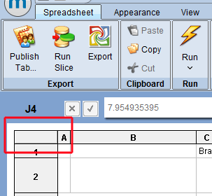
If you want to include the entire contents of the spreadsheet, you can click the upper-left rectangle between the A & 1.
Select The Type of Data
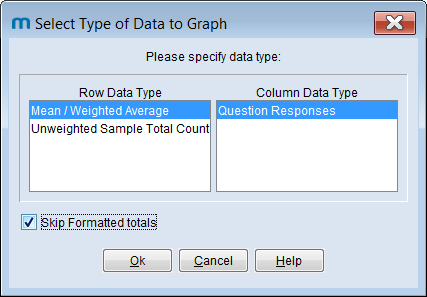
If your data includes only one format, your selection will look similar to this example, where questions with only the 'Mean' format are used.
If you want to ignore the 'Formatted Total' column in your charts, check the box that says, Skip Formatted Totals.
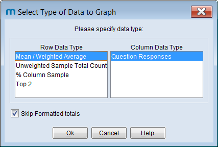
If your data includes more than one format type (e.g. questions are formatted as 'Percentages', 'Mean', and 'Top 2 Box'), your selection will look similar to this second example.
Click OK to chart your data.
Working With The Different Chart Types
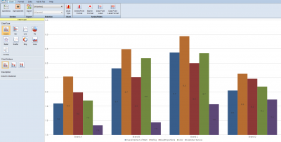
By default, your data will be displayed as a vertical bar chart. Click the different chart types to view your data as a different chart.
For additional details on individual chart settings and options, visit our support page for the Chart Gallery.
