Chart Gallery
Contents
Introduction
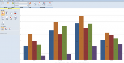
The default view on entering the Chart Editor is of the Chart Tab, and initially shows the Chart option. This enables you to select the chart type and subtype. The other ribbon options here are all chart properties that can be potentially altered for each series or datapoint.
A preview is shown on the right, using the current data. The chart is displayed at the size it appears on the page, but the zoom slider is available if required. The preview window has a default background color of white. If report style uses white text on a dark background, use the Background color dropdown control to make chart text legible.
Chart Type
This option allows you to choose a chart type and subtype from the gallery on the left.
Column Clustered
Data points for each series are plotted side by side
Column Stacked
Data points for each series are plotted in a stack
Column Stacked 100%
As Column Stacked, but the value axis has a fixed 100% maximum
Bar Clustered
Data points for each series are plotted side by side
Bar Stacked
Data points for each series are plotted in a stack
Bar Stacked 100%
As Bar Stacked, but the value axis has a fixed 100% maximum
Line
Line or point chart
Vertical Line
Vertical line or point chart
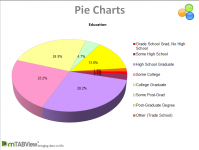
Pie
Pie chart
Exploded Pie
Pie chart with all segments exploded
3D Pie
3D pie chart
3D Exploded Pie
3D pie chart with all segments exploded
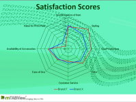
Radar
Radar chart plotting only lines
Radar with Markers
Radar chart plotting lines with markers
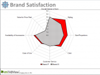
Filled Radar
Radar chart with filled areas
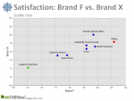
Scatter
Scatter chart plotting datapoint markers only
Scatter with Lines
Scatter chart plotting lines only
Scatter with Lines and Markers
Scatter chart plotting both lines and markers
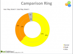
Ring
Ring/Donut chart
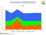
Area
Area chart with areas superimposed
Area Stacked
Area chart with areas stacked
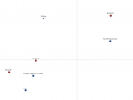
Correspondence
Correspondence Analysis
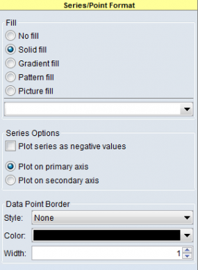
Series/Point Format
This panel allows you to change the style of the data points, either individually or collectively. By default the formatting options are applied to all series and points on your chart. To change this, use the two Selection dropdown controls on the left side of the chart ribbon. The first dropdown selects the series, and the second selects points. Selecting a particular series, and 'All Points' will format all points in that series. To select only a single point, select both the desired series and point. An alternate method of quickly selecting an single point is to click on it in the chart preview.
The options available vary depending on the chart type selected
Fill
This option changes the fill color and style of a data point or series. For line, point and spider style charts, this controls the line and marker color. For chart types where the data point has a filled area, additional gradient and pattern fill options are available.
Series Options - Plot series as negative values
When this option is ticked, the values of the selected series will be converted to negative, and plotted accordingly.
Data Point Border
When a chart style has a filled region for each data point, this option allows the style, color and width of the area border to be changed.
Line
For Line, Spider and Line Scatter charts, this option changed the line style and width.
Marker
For charts featuring lines or point markers, the marker shape and size can be specified.
Pie/Ring Chart option - start angle
The angle (0-360 degrees) at which the first datapoint is plotted.
Ring Chart option - hole size
The radius of the centre hole as a percentage of the total ring radius.
Data Point Label
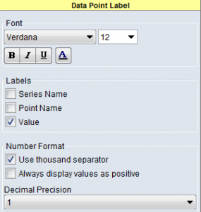
This panel controls the appearance of the text labels of datapoints. As with the series/point format panel, the style can be set for all points, each series, or each point.
Font
The font name,size, style and color can be set.
Labels
In addition to the numerical value corresponding to the data point, the series name and point name can also be displayed. For scatter charts, the X and Y values can also be shown.
Number Format-Use Thousands Separator
The normal thousands separator will be used (as specified by the regional setting of the user's PC).
Number Format-Always display values as positive
Even if a datapoint value is negative, and is plotted as such, the displayed value can be set to not display a minus sign by selecting this option.
Number Format-Decimal Precision
The number of decimal places to which the data point value is displayed on the label. Note that the precision used for plotting purposes is set in the data range editor. e.g. an actual value of 8.5 with a data range precision of 1 and a display precision of 0 will be plotted at 8.5 and have a label of 8. An actual value of 8.5 with a data range precision of 0 and a display precision of 1 will be plotted at 8.0 and have a label of 8.0.
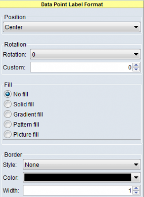
Data Point Label Format
This panel controls the appearance of the datapoint label as a whole ie the rectangle that contains the data point value/text. The position, rotation and box styling is all controlled here.
Position
Sets the position of the label relative to the data point. The options vary depending on the chart type being used.
Rotation
The rotation dropdown control changes the label rotation in 45 degree units. The Custom option allows any angle to be selected.
Fill
Selects the color and fill style of the rectangular area behind the data point label text.
Border
Sets the color, style and width of the border around label area.
