Correspondence analysis
Correspondence Analysis is a statistical technique that is used to graphically represent the associations between values in a cross tabulation table within a two dimensional chart. The relative positions of the row and column points on the resultant chart are consistent with the relative associations of the row and column data in the cross tab table. Consequently, a key benefit of a correspondence analysis chart is the ability to quickly identify associations that may not have been immediately evident by examining data within a large cross tab table.
The relevant measure shown on the chart are the relative positions of the points; the closer together the points are, the more closely they are associated. There isn't an equivalent X or Y "scale" as in a typical bar or line chart.
Since the relative positions of points on the chart underlie the meaning of the analysis, analysts will commonly overlay circles surrounding closely clustered points, typically including one of the column or categorical dimensions. There is absolutely nothing wrong with this operation, but it should be noted that the selection of points is subjective and it can only be said that the points within the circle are more closely associated than the points outside of the circle.
To restate, the benefit from this graphical display is the ability to identify unexpected associations between column and row values that were not immediately apparent from the observation of the cross tab table. The larger (i.e. more rows and columns) the cross tab, the more useful this display becomes by clarifying the associations and allowing the analyst to subsequently bring focus to the cross tab table results.
How to create a correspondence analysis chart using mTAB
The cross tab configuration for a correspondence chart would be similar to that of a radar chart or TopN report; first select a categorical question as your columns, for example, brands, products, product segments, respondent segments (clusters, age groups, lifestages, etc.). Next, select rows containing the various explanatory measures such as satisfaction, imagery, awareness, usage, problems, etc. You can selected a battery of row questions of a scalar type (e.g. Extremely Satisfied = 5, Extremely Unsatisfied = 1) formatted to a Top / Bottom Box or Mean value, or alternatively, a multiple response question can be used as rows. It doesn't matter if row questions are formatted as percentages or means, as correspondence analysis is valid for any positive value, and any mix of format types can be used within the analysis. It should be noted however, that mTAB requires at minimum three selected columns in order to create a correspondence analysis chart.
The example cross tab shown is a representative of satisfaction metrics for selected brands.
Note that the customer satisfaction metrics are represented as "Top 2 Box" responses using mTAB's question formatting.
Creating the mTAB correspondence chart is similar to other chart types. Select the data to be charted and then click the chart toolbar button. As illustrated in the screenshot, we have selected the columns representing a brand (i.e. we exclude the total columns).
Next click the New Graph icon in the spreadsheet ribbon to construct a chart. In the subsequent "Select Type of Data to Graph" dialog, confirm your intention to graph the "Top 2 Box" data.
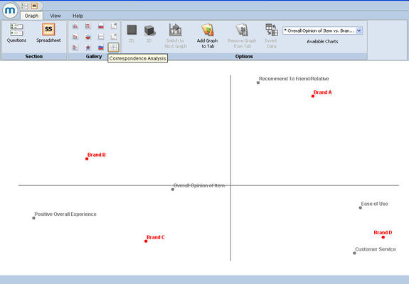
From within the chart, select the Correspondence Analysis from the gallery options.
Note that "tool tips" are displayed as you move your mouse over the tools to help identify the various mTAB chart tool types.
In the chart shown, there are clear groupings of satisfaction metrics and selected brands, and these groupings can be further clarified by drawing circles on the chart which we will perform with photo editing software after exporting the chart from mTAB.
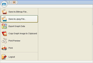
To export a chart from mTAB's chart dialog, go to the File menu and select Save as Jpeg File. Prior to exporting, you can change the title of the chart through the View ribbon menu and clicking on Chart Properties.
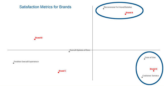
The final exported chart as shown below was modified to include "overlay circles" using Adobe Photoshop software. The modified chart can now be readily included within other documents such as a PowerPoint presentation.
To summarize the correspondence chart analysis represented in the chart above, Brand A is more closely associated with the satisfaction metric "recommend to friend/relative" whereas Brand D is more closely associated with the metrics "ease of use" and "customer satisfaction".


