Correlation
Correlation determines if there is a connection between two variables.
When one variable changes, the other variable changes in a specific direction.
Statistical correlation is a quantitative way to measure the direction and strength of the tendency to vary together.
-1.00 Perfect Correlation (both variables move in opposite directions)
 0.00 No Correlation
 1.00 Perfect Correlation (both variables move in the same direction)
Please follow these steps and guidelines to setup and run correlation in mTAB.
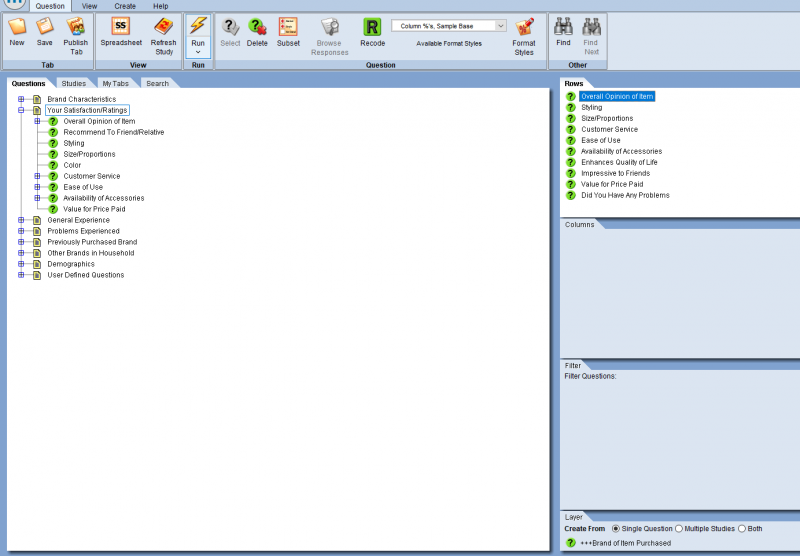
Begin by including questions in rows. The most commonly used question types for correlation reports run in mTAB are Likert-scale or ratings questions.
Columns are not used in correlation. If a question is included in columns, it will be ignored.
Including a Filter is optional.
Including a Layer question is optional. This example includes a Brand question in Layer. If a Layer question is used, it will default to the Outside Worksheets orientation and display results in the worksheet format.
Important: Include the question you would like to correlate the rest of the questions to at the top of the list in rows.
In this example, Overall Opinion is included first, so the rest of the questions will be correlated to Overall Opinion.
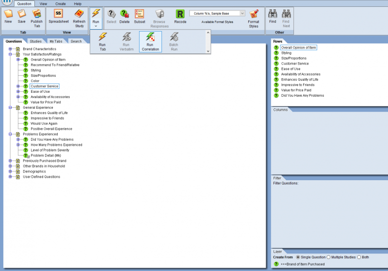
Click the bottom part of the Run (lightning bolt) icon.
It will expand and offer additional Run options.
Click the Run Correlation icon.
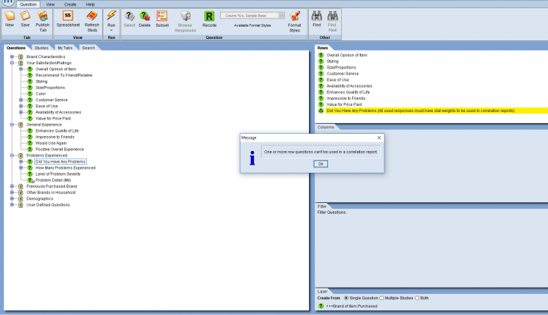
If you receive a warning message that highlights any of your row questions, this most likely means that the question you selected does not have any stat values assigned to it.
To proceed with a correlation report, you’ll need to assign some type of stat values to the highlighted questions.
Note: Multi-response questions are not allowed with Correlation.
      Group questions can be used if you include them in both rows and layer.
      A group question cannot be run with Correlation if it is just included in rows.
Proceed by double-clicking the highlighted question.
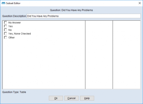
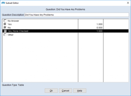
The Subset Editor will appear.
In this example, the responses (Yes, No, etc.) do not have any numeric stat values assigned to them.
Assign your own values by clicking in the column to the right of the question and enter stat values for each response.
If assigning a stat value is not applicable for one or more responses, you can use the subset feature to include only the responses you’ve assigned values to.
In this example, plus signs [+] indicate that Yes, No, and Yes, None Checked will be included in the correlation report.
Other will not be, since it does not have a stat value assigned.
Click OK to proceed and exit out of the Subset Editor.
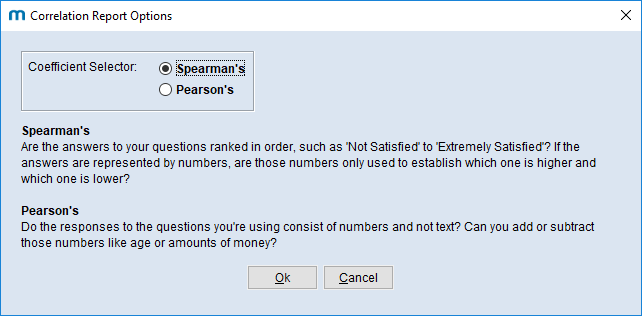
mTAB currently supports two types of correlation, Spearman’s and Pearson’s.
By default, mTAB will run Spearman’s, but you can change the option, based on the descriptions for the type of data you would like to run.
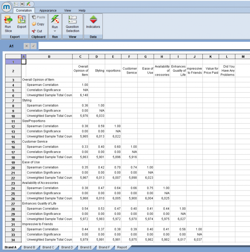
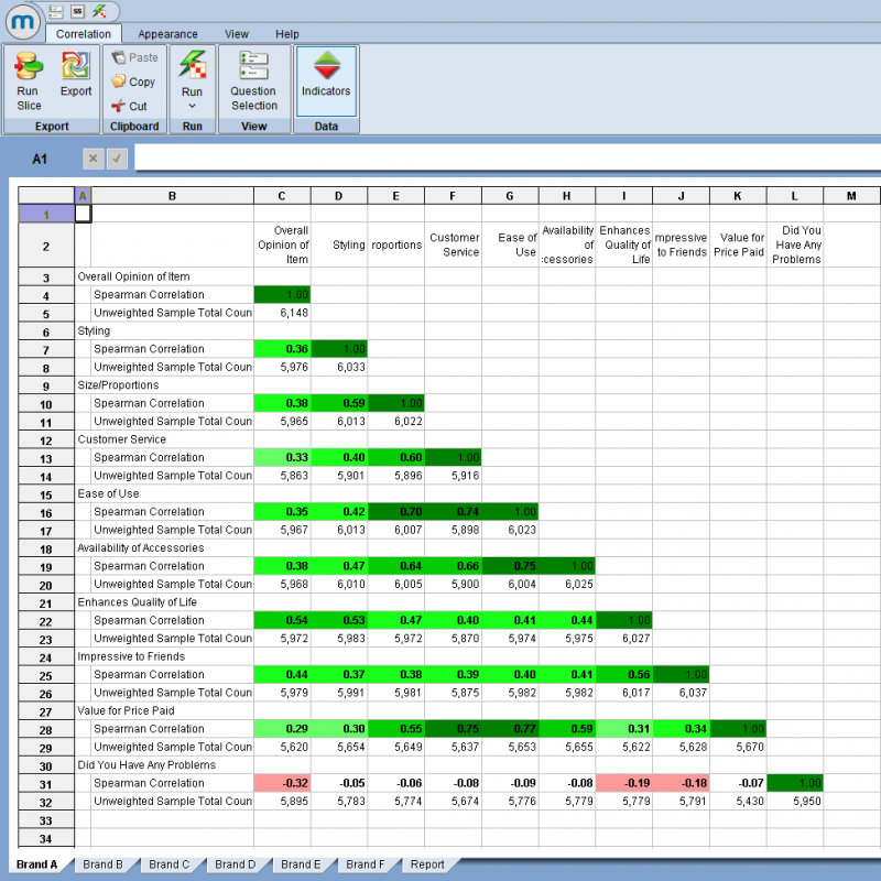
The correlation report will run.
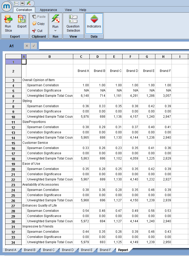
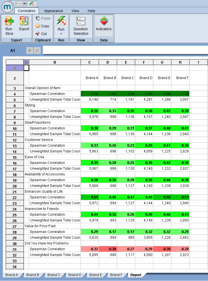
Since a question was included in Layer (Brand question), the correlation report will include a worksheet per brand and an additional Report view sheet, which includes the correlation results for Overall Opinion for each brand.
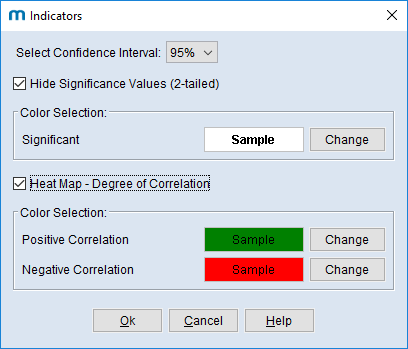
Click on the Indicators icon
The following options are available:
Hide Significance Values
This hides the Correlation Significance rows and values (most will be 0.00) for each question.
Select Confidence Interval
Options include either 95% or 99%.
The default is 95.
Significant
Significant values are identified in bold font.
A value in bold font is equivalent to other programs such as SPSS assigning an asterisk (*) to identify 95% significance and two asterisks (**) to identify 99% significance.
Heat Map - Degree of Correlation
This option assigns colors to help categorize the strength of the correlation.
The darker the color, the stronger the correlation.
The default colors of green and red identify positive correlation (green) and negative correlation (red).
The colors can be changed based on user preference.
There are 6 heat map ranges:
0.84 to 1.00 = Darkest
0.67 to 0.83
0.50 to 0.66
0.34 to 0.49
0.17 to 0.33 = Lightest
0.00 to 0.16 = No Color
Each range is 0.1666666 wide (1/6).
Positive and negative correlation use the same scale for colorization.
Note: The heat map colorization is not identifying significance or any other type of mathematical calculation. It is intended more as an art to categorize correlation strength.

Green identifies a positive correlation, so the 2 questions (such as Overall Opinion and Ease of Use) change in the same direction.

Red identifies a negative correlation, so the 2 questions (such as Overall Opinion and Did You have any Problems) change in the opposite direction.
Click the Export icon to save a fully editable file of the correlation report in either XLSX or other formats.
