Significance testing - Adjacent columns
In a previous article we covered the general topic of Significance Testing and how that can be applied to means and percentages. In that article, we illustrated how the mTAB™ Significance Indicators can be used to show significant differences versus a specific base column, or by comapring all columns with one another. This functionality has now been enhanced with the addition of the "Significance to Adjacent Columns" option.
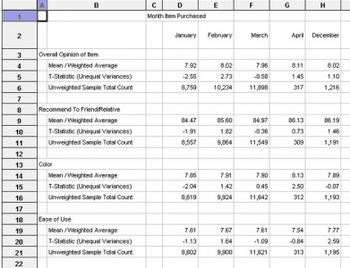
When faced with a report (as shown below) where you are comparing data across time period, whether it be month, quarter, etc, it can be very useful to be able to compare column to column to look for statistically significant changes.
So we would want to compare January and February, then February and March, then March and April and so on. Previously, the only way to do so would have been to use the significance to base column option and to repeatedly change the base column month by month.
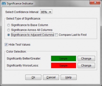
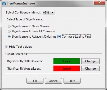
Clicking on the Significance Indicator icon in mTAB™ brings up the dialog, displaying all of the available testing options and as you can see, a new option has now been added named "Significance to Adjacent Columns".
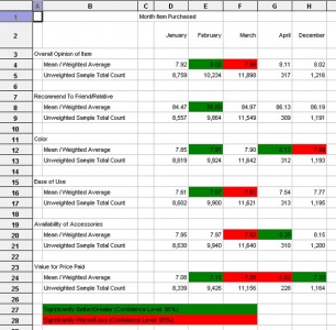
Selecting this option and clicking OK, yields a report with the color indicators on as shown. The color in February column (Col E), indicates any signnificant difference between January and February. The color in March column (Col F), indicates any signnificant difference between Febraury and March and so on.
In some cases, it is not only useful to compare month by month, but can be equally useful to compare across the whole time period being analyzed, allowing you to see if the overall change is statistically significant. So, in addition to the Adjacent Column option, our dialog also contains a check box marked "Compare Last to First".
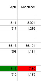
Checking this box and then clicking OK, will yield the same report that we just had, with the same column by column coloring. In addition though, in the final column, you will occasionally see an arrow (pointing up or down). This indicates any statistically significant difference that may exist between the last column in the report (December in our case) and the first (January).
The use of the arrow allows the final column to represent 2 statistical comparisons in just one cell. Should you export such a report to Excel, the arrows will be carried to the Excel worksheet.
